Understanding Spring Colour Palettes
Spring colour palettes are designed to evoke the refreshing essence of the season, bringing a sense of renewal and vibrancy into any space. These palettes typically feature lighter, brighter, and more cheerful hues, reminiscent of blooming flowers and lush greenery after a long winter. Incorporating these colours can significantly uplift the mood and aesthetic of your home, making it feel more airy and inviting.
The impact of spring colours on design is profound; they can transform a dull room into a lively sanctuary, reflecting the optimism and energy of the season. Whether you’re redecorating your entire home or simply adding a few decorative touches, understanding how to effectively use these palettes is key to achieving a harmonious and aesthetically pleasing result.
For homeowners looking to brighten their spaces, exploring various design elements becomes crucial. From selecting the right window treatments that allow ample natural light to choosing custom solutions for distinctive window designs that perfectly match your decor, embracing spring colour palettes offers a wonderful opportunity to revitalize your living environment. We’ve seen how these fresh colours can truly transform spaces, making them feel more expansive and cheerful.
Choosing the right window treatments can enhance the seasonal feel of your home. Consider how stylish and energy-efficient window shades can complement your chosen spring palette, offering both aesthetic appeal and practical benefits. For those seeking a personalized touch, custom window treatments provide the perfect way to integrate specific spring hues and patterns into your decor.
Ultimately, embracing the spirit of the season through colour can lead to a beautifully refreshed home. Even a simple update, like considering spring colour palettes for your Toronto home, can make a significant difference in creating a welcoming atmosphere.
Understanding the Spring Color Palette
The spring color palette is characterized by its clarity, brightness, and a gentle warmth, mirroring the awakening of nature. Unlike the deeper, richer tones of autumn or the cool, muted shades of winter, spring colours are lively and optimistic, often featuring a yellow undertone that makes them feel fresh and energetic. These palettes are ideal for creating spaces that feel open, airy, and full of life.
| Palette Type | Characteristics |
|---|---|
| Spring | Clear, bright, warm, lively, optimistic, yellow undertones. |
| Summer | Soft, muted, cool, gentle, dusty, blue undertones. |
| Autumn | Warm, rich, earthy, deep, golden undertones. |
| Winter | Clear, cool, sharp, high contrast, blue undertones. |
When considering how to enhance your home’s aesthetic, the choice of window treatments plays a significant role. For instance, exploring window treatments that enhance home elegance can tie in perfectly with the vibrant feel of a spring palette. These colours aren’t just for interior design; they can also be reflected in seasonal decor trends, as seen in fall home decor trends, showcasing how colour palettes evolve throughout the year. When aiming for a bright and inviting atmosphere, using these colours in your window fashions can make a substantial difference.
Choosing the right shades for your windows is an integral part of creating a cohesive look. Whether you are aiming to brighten your home with spring colour palettes or simply seeking effective light control, the right window coverings will enhance the overall design. Our team understands the importance of selecting colours that resonate with the season and your personal style.
Key Colors in a Spring Palette
A spring colour palette is defined by its luminous and fresh hues, drawing inspiration directly from the natural world as it awakens. These colours are typically light, clear, and possess a distinct warmth, often with a subtle yellow undertone that makes them feel energetic and joyful. They evoke feelings of new beginnings, growth, and vitality, making them perfect for spaces that you want to feel uplifting and cheerful.
Incorporating these vibrant shades into your home can be achieved through various elements. For example, a pop of colour in your kitchen can be achieved with top window treatments for modern kitchens, or you might consider how new window treatments can align with your home’s existing aesthetic, as discussed in guides for areas like Newmarket.
- Soft Greens: Think of new leaf green, mint, or a pale lime. These colours bring a sense of freshness and nature indoors.
- Sunny Yellows: From pale buttercup to a brighter daffodil, these hues inject warmth and optimism into a room.
- Peachy Pinks: Soft and gentle, these shades offer a touch of sweetness and romance, reminiscent of cherry blossoms.
- Aqua and Light Blues: These colours evoke clear spring skies and tranquil waters, adding a serene and refreshing feel.
- Coral and Soft Oranges: Vibrant yet not overpowering, these colours add a playful and energetic touch.
When selecting window treatments, consider how these colours can frame your views and influence the natural light entering your home. For instance, window treatments in spring colours can significantly amplify the seasonal theme. It’s also important to consider how these colours work with your overall decor, ensuring they complement your chosen style, whether it’s a modern kitchen or a serene bedroom; for more ideas on choosing the right window coverings, explore our top tips for dressing your windows for more.
To truly capture the essence of spring in your home, consider how these colours can be applied to different aspects of your decor. Understanding the nuances of each shade can help you create a balanced and inviting atmosphere, ensuring that your chosen colours work harmoniously together. For those in specific regions, exploring local options for window treatments in Newmarket can provide tailored solutions.
Vibrant Yellows and Oranges
Sunny yellows and warm oranges are staples of the spring palette, bringing an undeniable sense of joy and energy to any design. These hues mimic the warmth of the spring sun and the cheerful bloom of flowers, making them excellent choices for spaces where you want to foster a positive and inviting atmosphere. Whether used as a primary colour or as an accent, these shades can instantly brighten a room.
Consider
Fresh greens and soothing aquas are quintessential spring colours that bring the vitality of nature indoors. Greens, ranging from mint to emerald, symbolize growth, renewal, and harmony, while aquas and light blues evoke clear skies and tranquil waters, promoting a sense of calm and spaciousness. Together, they create a refreshing and balanced atmosphere.
These cool yet lively tones are perfect for creating a serene retreat within your home. They can be beautifully complemented by lighter wood tones or crisp white accents. Exploring window treatments in these spring-inspired colours can enhance the feeling of bringing the outdoors in, especially when considering our 5 best easy to clean window treatments.
Subtypes of Spring Palettes
While the general spring colour palette is characterized by its brightness and warmth, there are several subtypes that cater to more specific undertones and colour intensities. Understanding these variations allows for a more personalized and precise application of spring colours in design, ensuring the palette perfectly suits individual preferences and existing decor. These subtypes help to refine the overall feel, whether you’re aiming for something exceptionally bright, gently warm, or softly clear, and exploring the 2024 spring window treatment trends can offer inspiration.
- Light Spring: Characterized by clarity and a gentle, airy feel. Colors are soft and delicate, often with a dewy, fresh quality. Think of pale pastels and soft, luminous tones. These colours are perfect for creating a sense of spaciousness and light, making them ideal for smaller rooms or spaces that receive less natural light.
- Warm Spring: Defined by a vibrant and clear warmth. Colors are rich and lively, with a noticeable yellow undertone. This subtype evokes feelings of sunshine and blooming flowers. Warm spring palettes are excellent for creating energetic and inviting environments that feel cozy and cheerful.
- Bright Spring: Known for its high contrast and striking clarity. Colors are intensely saturated and radiant, often with a hint of coolness that makes them pop. This subtype is bold and energetic. Bright spring palettes are perfect for making a statement and adding a dynamic flair to any design project, much like optimal blind settings can enhance a room’s atmosphere.
Each subtype offers a unique way to interpret the spring aesthetic. For instance, a bright spring palette can be stunning when applied to bold accents in home decor, while a light spring palette might be ideal for creating a serene atmosphere with window treatments. The choice of subtype can significantly influence the mood and style of your space, allowing for highly personalized design choices.
When considering window treatments, understanding these subtypes can help you select colours that truly harmonize with your overall design vision. For example, if you’re drawn to the vibrant energy of a bright spring, you might choose bold coloured blinds or curtains. Conversely, a light spring preference might lead you to opt for sheer fabrics in pastel shades. Exploring window treatments that elevate your home’s style can be a fantastic way to implement these seasonal palettes.
How to Use Spring Color Palettes in Your Home
Incorporating spring colour palettes into your home decor is a fantastic way to usher in a sense of freshness, optimism, and renewal. These vibrant and light-filled hues can transform any space, making it feel more inviting and cheerful. The key is to apply them thoughtfully, whether through large design elements or subtle accents, to create a balanced and harmonious aesthetic that reflects the season’s spirit. For inspiration on how to bring these seasonal changes to your windows, explore our guide to 2024 spring window treatment trends.

- Accent Walls: Use lighter, brighter spring hues for a subtle pop of colour. Consider a soft coral or a gentle mint green on one wall to add visual interest without overwhelming the space.
- Furniture Choices: Select pieces in soft greens, peachy pinks, or sunny yellows to invigorate a room. A sofa in a pale spring green or accent chairs in a cheerful yellow can become focal points.
- Textiles: Incorporate throw pillows, blankets, and rugs in floral prints or solid spring shades. These elements are easy to swap out seasonally, allowing for flexibility in your decor.
- Accessories: Add decorative items like vases, artwork, or lamps in vibrant spring tones. Small touches of colour can make a big impact and tie your theme together.
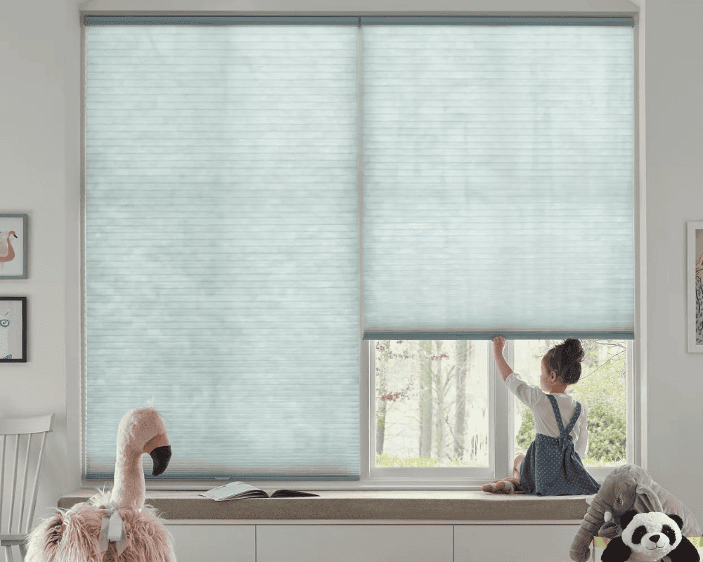
- Window Treatments: Opt for curtains, blinds, or shades in spring-inspired colours or patterns to frame your views and control light. Window treatments are a significant design element that can introduce seasonal colour effectively.
Having worked with homeowners in the GTA for years, our team has learned that incorporating lighter, brighter spring tones through window treatments can significantly brighten even the smallest spaces. For example, selecting custom window treatments in a soft aqua or a sunny yellow can enhance natural light and create an airy feel. When deciding between options, a zebra vs roller blinds comparison can help you choose the best fit for your style and needs.
When considering how to integrate these palettes, think about the overall mood you want to achieve. Do you desire a serene and calm environment, or something more energetic and playful? The right application of spring colours, from furniture to window coverings, can help you realize your design goals.
Spring Color Palettes for Fashion
The vibrant and refreshing energy of spring is perfectly captured in fashion through the use of spring colour palettes. These palettes translate the season’s natural beauty into wearable art, encouraging a lighter, brighter approach to personal style. Think of the soft pastels of blooming flowers, the clear blues of a spring sky, and the lively greens of new foliage – all translated into clothing and accessories.
Adopting spring colours in your wardrobe can significantly impact your overall look and mood, making you feel more energized and optimistic. This seasonal approach to fashion often mirrors trends in home decor, suggesting a cohesive aesthetic that extends beyond personal attire. For instance, the same cheerful hues seen in spring clothing might inspire choices for window treatments or other home accents, especially when looking for privacy shades that allow light for more.
When considering seasonal wardrobes, the transition from winter to spring often involves shedding heavier fabrics and darker colours for lighter materials and brighter shades. This shift can be seen in everything from casual wear to more formal attire. Similarly, the transition in home decor trends throughout the year reflects a similar desire to align our living spaces with the prevailing mood of the season.
The concept of seasonal colour analysis, which identifies palettes suited to an individual’s natural colouring, also highlights the distinct characteristics of spring palettes. These fashion choices can influence broader design decisions, such as selecting window treatments that complement your personal style and the overall aesthetic of your home.
Spring Color Palettes for Graphic Design
In graphic design, spring colour palettes are utilized to convey freshness, vitality, and a sense of optimism, mirroring the season they represent. These palettes typically consist of bright, clear, and warm colours that evoke feelings of new beginnings and growth. They are exceptionally effective for branding, marketing materials, and digital interfaces where an uplifting and engaging visual appeal is desired.
The application of spring colours in graphic design can range from subtle pastels to bold, saturated hues. For instance, a brand aiming for a clean and modern look might use soft greens and light blues, while a campaign seeking to convey high energy might opt for vibrant yellows and corals. This versatility makes spring palettes a popular choice for designers looking to create visually appealing and emotionally resonant work.
When creating visually appealing designs, the strategic use of colour is paramount. Whether it’s for a website, a logo, or marketing collateral, the chosen palette significantly influences the audience’s perception. Much like how window treatments can define the atmosphere of a room, colour palettes define the personality of a brand or design project. Consider how these vibrant hues could translate into striking window coverings, and if you’re in the area, explore why Sun Shades is the top choice for blinds in Vaughan for more.
The choice of colour can also influence user engagement and brand recognition. A well-executed spring palette in a design can make a product or service seem more approachable and modern. This principle extends to interior design, where similar colour choices in custom window treatments can create a cohesive and inviting atmosphere that resonates with viewers.
Seasonal Color Analysis: The Spring Persona
Seasonal color analysis is a system used to determine the most harmonious colour palette for an individual based on their natural colouring, categorizing people into four main seasons: Spring, Summer, Autumn, and Winter. The ‘Spring’ persona is characterized by warm undertones, clear and bright colouring, and a vibrant overall appearance, much like the season itself.
Individuals who fall into the Spring category typically look best in colours that are bright, clear, and warm, often with a yellow base. These colours enhance their natural radiance and vitality. This understanding of personal colour palettes can significantly influence choices in fashion, makeup, and even home decor, including the selection of window treatments that complement one’s natural colouring and overall home aesthetic. For those looking to enhance their living space, consider how spring colour palettes can bring life to your surroundings, and explore the top reasons to choose sun shades for window treatments in Vaughan.
The Spring persona thrives in environments that mirror their own vibrancy. This translates into a preference for lively, clear colours in their surroundings. When selecting elements like window treatments, individuals with a Spring colouring often find that palettes reflecting the season—think bright corals, sunny yellows, and fresh greens—enhance their natural glow and make their living spaces feel more harmonious and inviting.
Understanding your seasonal colour type provides a valuable guide for making confident choices in various aspects of life. Whether you’re choosing an outfit or selecting custom window treatments, aligning your choices with your natural palette can create a sense of balance and enhance your personal style and living environment.
Conclusion: Embrace Spring Colors
Spring colour palettes offer a refreshing and optimistic approach to design, fashion, and personal expression. Their inherent brightness, clarity, and warmth evoke the joy and renewal of the season, making them ideal for transforming spaces and uplifting spirits. By understanding the characteristics and applications of these vibrant hues, individuals can create environments that feel lively, welcoming, and full of life.
Whether you are redecorating your home, updating your wardrobe, or designing marketing materials, embracing spring colours can lead to dynamic and engaging results. The versatility of these palettes allows for both subtle accents and bold statements, ensuring there’s a perfect spring shade for every taste and purpose. We encourage you to explore how these colours can invigorate your surroundings and bring a touch of seasonal cheer into your daily life.
Consider how integrating these bright, cheerful colours into your home, perhaps through window treatments, can significantly enhance the atmosphere. Our team at Sun Shades Window Fashions is dedicated to helping you find the perfect solutions that align with your design vision and bring the essence of spring into your home. You can explore our wide range of products and services on our website.
To begin your home transformation, we invite you to visit Sun Shades Window Fashions for more. We offer a variety of solutions to suit your needs, from stylish blinds to energy-efficient shades. For specific inquiries or to discuss your project, please feel free to contact us for more. If you’re in the Vaughan area, discover why we are a top choice for blinds in Vaughan and beyond.
Embracing spring colours is more than just a design trend; it’s an invitation to experience a brighter, more joyful way of living. Let the spirit of renewal infuse your home and your life. Discovering 2024s most exciting window treatment trends can help you bring these fresh hues into your space.
Frequently Asked Questions
Here are answers to some common questions about spring colour palettes and their application in home decor and design.
| Question | Answer |
|---|---|
| What are the main characteristics of a spring colour palette? | Spring colour palettes are known for their clarity, brightness, and warmth. They often have a yellow undertone and evoke feelings of freshness, renewal, and optimism, similar to the season itself. |
| How can I incorporate spring colours into my home decor? | You can incorporate spring colours through accent walls, furniture choices, textiles like throw pillows and rugs, accessories, and importantly, window treatments. These colours can bring a cheerful and airy feel to any room. |
| Are spring colour palettes suitable for all types of homes? | Yes, spring colour palettes can be adapted for various home styles. While they naturally lend themselves to bright and modern aesthetics, softer versions can also create a serene and welcoming atmosphere in more traditional settings. |
| What is the difference between Light Spring and Bright Spring palettes? | Light Spring palettes are soft, delicate, and airy, featuring pale pastels and luminous tones. Bright Spring palettes, on the other hand, are intensely saturated and radiant, characterized by high contrast and bold, energetic colours. |
| How do spring colours relate to seasonal colour analysis? | In seasonal colour analysis, the ‘Spring’ persona is defined by warm undertones, clear colouring, and vibrant features. Individuals of this type look best in the bright, warm, and clear colours that characterize the spring palette. |
| Can window treatments significantly impact the feel of a room when using spring colours? | Absolutely. Window treatments are a major design element. Choosing curtains, blinds, or shades in spring-inspired colours or patterns can dramatically enhance the room’s brightness, atmosphere, and overall adherence to the spring theme. For more information on selecting the right window coverings, explore our guide to window treatments for more. |